You are here

Visualization

US Flood Risk 'Severely Underestimated'


During Hurricane Harvey, Port Arthur in Texas experienced some the most extreme impacts of flooding - Getty Images

Scientists and engineers have teamed up across the Atlantic to "redraw" the flood map of the US.

bbc.com - by Victoria Gill - 11 December 2017

Their work reveals 40 million Americans are at risk of having their homes flooded - more than three times as many people as federal flood maps show.

The UK-US team say they have filled in "vast amounts of missing information" in the way flood risk is currently measured in the country.

They presented the work at the 2017 American Geophysical Union meeting.

(CLICK HERE - READ COMPLETE ARTICLE)

CLICK HERE - 2017 American Geophysical Union meeting


Country / Region Tags: 
Problem, Solution, SitRep, or ?: 

NASA Map of Earth's Seasons Over 20 Years Highlights Climate Change

The visualization shows spring coming earlier and the Arctic ice caps receding over time

NASA - theguardian.com - AP - November 17, 2017

Nasa has captured 20 years of changing seasons in a striking new global map of planet Earth​.

The data visualization, released this week, shows Earth’s fluctuations as seen from space.

(READ COMPLETE ARTICLE)

CLICK HERE - NASA - The Living Planet - The Changing Colors of our Living Planet

CLICK HERE - NASA - Our Living Planet from Space

Country / Region Tags: 
Problem, Solution, SitRep, or ?: 

Facebook Disaster Maps - Using Data to Help Communities Recover and Rebuild

newsroom.fb.com - By Molly Jackman - June 7, 2017

Today, we are introducing disaster maps that use aggregated, de-identified Facebook data to help organizations address the critical gap in information they often face when responding to natural disasters. Many of these organizations worked with us to identify what data would be most helpful and how it could be put to action in the moments following a disaster.

This initiative is the product of close work with UNICEF, the International Federation of the Red Cross and Red Crescent Societies, the World Food Programme, and other organizations. 

(READ COMPLETE ARTICLE)

ALSO SEE RELATED ARTICLE HERE - Surveillance for good? Facebook tracks disaster victims

CLICK HERE - Mark Zuckerberg - Facebook

Country / Region Tags: 
Problem, Solution, SitRep, or ?: 

USGS Releases New JavaScript Library for Plotting Water Data for the Nation

submitted by Carrie La Jeunesse


In this example, time-series data for the USGS station at Jacobs Well near Wimberley, Texas (https://waterdata.usgs.gov/nwis/uv?site_no=08170990) is shown from January 9 through 29, 2017. The GWIS plot shows both streamflow and specific conductance in the graph. Double y-axes are used showing how specific conductance changes as streamflow increases.

usgs.gov - February 8, 2017

A new JavaScript library, called GWIS (Graphing Water Information System), can create time-series plots of information measured at U.S. Geological Survey hydrologic data collection sites across the United States.

Developed by the USGS Texas Water Science Center, the user-friendly interface integrates the open-source dygraphs JavaScript charting library with hydrologic data provided by USGS water services.

Country / Region Tags: 
General Topic Tags: 
Problem, Solution, SitRep, or ?: 

Arctic Heating Up at Twice as Fast as Rest of Globe


Arctic Sea Ice Disappearing

CLICK HERE - NOAA - Arctic Report Card: Update for 2016

cnn.com - by Mayra Cuevas and Max Blau - December 14, 2016

The Arctic is heating up twice as fast as the rest of the world -- triggering a "massive decline in sea ice and snow," according to a new federal report.

On Tuesday, the National Oceanic and Atmospheric Administration released its 11th annual Arctic Report Card, which compiles data from 61 scientists in 11 countries.

"Rarely have we seen the Arctic show a clearer, stronger or more pronounced signal of persistent warming and its cascading effects on the environment than this year," Jeremy Mathis, director of NOAA's Arctic Research Program, said in a statement.

(READ COMPLETE ARTICLE)

CLICK HERE - NASA - Scientific Visualization Studio - Weekly Animation of Arctic Sea Ice Age with Graph of Ice Age By Area: 1984 - 2016

CLICK HERE - VIDEO - NASA - Older Arctic Sea Ice Disappearing


Country / Region Tags: 
General Topic Tags: 
Problem, Solution, SitRep, or ?: 

NASA Finds New Way to Track Ocean Currents from Space

NASA's GRACE satellites (artist's concept) measured Atlantic Ocean bottom pressure as an indicator of deep ocean current speed. In 2009, this pattern of above-average (blue) and below-average (red) seafloor pressure revealed a temporary slowing of the deep currents. Image credit: NASA/JPL-Caltech

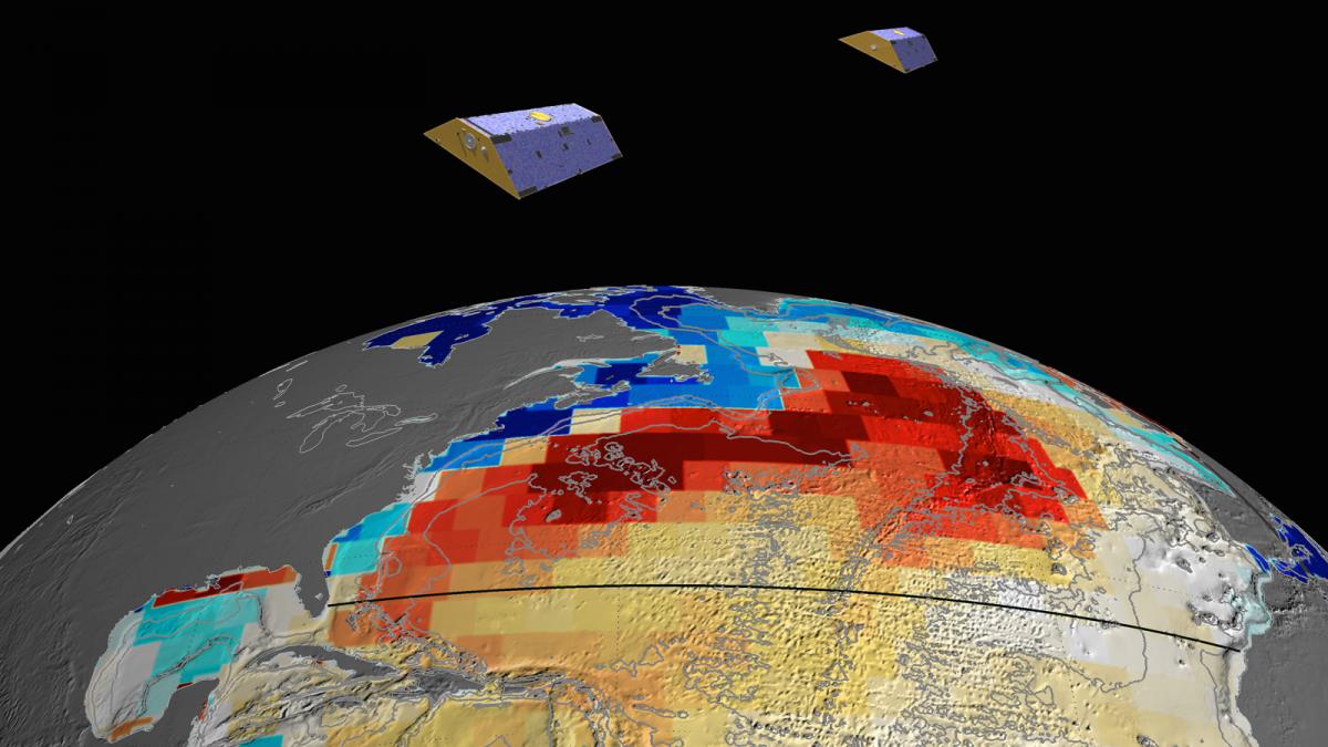
Image: NASA's GRACE satellites (artist's concept) measured Atlantic Ocean bottom pressure as an indicator of deep ocean current speed. In 2009, this pattern of above-average (blue) and below-average (red) seafloor pressure revealed a temporary slowing of the deep currents. Image credit: NASA/JPL-Caltech

jpl.nasa.gov - November 2nd, 2015

A team of NASA and university scientists has developed a new way to use satellite measurements to track changes in Atlantic Ocean currents, which are a driving force in global climate. The finding opens a path to better monitoring and understanding of how ocean circulation is changing and what the changes may mean for future climate.

(VIEW COMPLETE ARTICLE)

Country / Region Tags: 
General Topic Tags: 
Problem, Solution, SitRep, or ?: 

Humanitarian UAV (“Drone”) Experts Meet at MIT

submitted by Andrew Schroeder


directrelief.org - by Andrew Schroeder - October 14, 2015

Early Fall mornings in Cambridge, MA have the feeling practically of American myth. The sun rises over the mist that hangs like a blanket on the Charles River, lighting the water with a pale glow that filters through multi-colored leaves and glints off the steel and glass fronts of the buildings which line the campus of the Massachusetts Institute of Technology (MIT). I’m hurrying down Massachusetts Ave towards Technology Square, wind in my face and coffee in hand, to arrive for the start of the second annual Humanitarian UAV (drone) Experts Meeting happening at MIT Lincoln Labs’ Beaver Works. The meeting is hosted by UAViators (Humanitarian UAV Network), a brainchild of my friend and colleague Patrick Meier.

(READ COMPLETE ARTICLE)

Country / Region Tags: 
Problem, Solution, SitRep, or ?: 

Google Street View cars are starting to map air pollution

Video: Video explaining the Aclima/Google Map partnership

theverge.com - July 29th, 2015 - Jacob Kastrenakes

A small number of Google Street View cars are recording more than photos of the road — they're also taking snapshots of the air quality around them. Aclima, a company that creates networks of environmental sensors, announced this week that it's been working with Google to put air quality detectors on some of its cars. The sensors allow Google's vehicles to pick up information on carbon dioxide, methane, black carbon, particulate matter, and other pollutants on a block-by-block basis.

(VIEW COMPLETE ARTICLE)

Country / Region Tags: 
General Topic Tags: 
Problem, Solution, SitRep, or ?: 

Humanity from Space

pbs.org - July 21, 2015

From the global perspective of space, this 2-hour special reveals the breathtaking extent of our influence, revealing how we’ve transformed our planet and produced an interconnected world of extraordinary complexity.

A journey through 12,000 years, Humanity from Space shows how seemingly small flashes of innovation have changed the course of civilization; innovations that touch all of us today in ways unimaginable to our ancestors. And we’ll gaze into the future at the new challenges we’ll face in order to survive as our global population soars because of our success.

CLICK HERE - PBS - Humanity from Space

CLICK HERE - YouTube - Humanity from Space

Country / Region Tags: 
Problem, Solution, SitRep, or ?: 

CDC - Mapping for Ebola: A Collaborative Effort


cdc.gov - January 14, 2015

One of the difficulties faced by teams responding to the current Ebola outbreak in West Africa is identifying individuals and communities residing in remote areas. Existing maps of these regions either do not exist or are inadequate or outdated. This means that basic data like location of houses, buildings, villages, and roads are not easily accessible, and case finding and contact tracing can be extremely difficult.

To help aid the outbreak response effort, volunteers from around the world are using an open-source online mapping platform called OpenStreetMap (OSM) to create detailed maps and map data of Guinea, Sierra Leone, Liberia, and parts of Mali.

(READ COMPLETE ARTICLE)

Country / Region Tags: 
Problem, Solution, SitRep, or ?: 

Pages

Subscribe to Visualization
howdy folks